
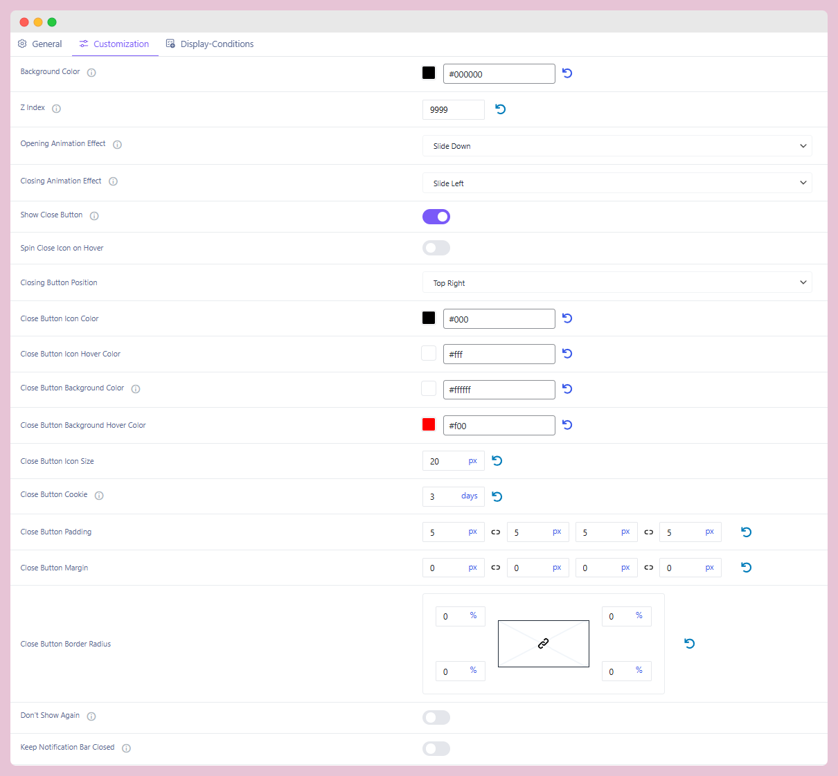
The Customization Settings panel allows you to design and fine-tune the look and behavior of your Alert Bars. From colors and animations to close button behavior, this section ensures you have full visual and functional control over how your bar is displayed to visitors.
Key Features
Define what action should cause the alert bar to appear. Options include:
Background Styling
Set the Alert Bar Background Color to match your website’s branding. You can easily choose a solid color or update it anytime using the color picker.
Opening & Closing Effects
Select animation effects that define how the bar appears and disappears on the screen (e.g., Slide Down, Slide Left). This helps the alert bar grab attention without being too intrusive.
Extended Close Button Customization
The close button comes with advanced customization options, including:
- Icon color and hover color
- Background color and hover state
- Icon size, padding, margin, and border radius
- Placement (e.g., top-right)
Additionally, you can set a Close Button Cookie that remembers user preferences, keeping the bar hidden for a specific duration (e.g., 3 days) once closed.
Don’t Show Again
Enable this to give users control: once they close the bar, it won’t appear again for them, creating a less disruptive browsing experience.
Keep Notification Bar Closed
When enabled, the alert bar remains closed across all pages for any visitor who has already dismissed it. This ensures consistency and avoids repetitive interruptions.
Finally, the Customization Settings provide complete flexibility to design alert bars that are visually engaging, user-friendly, and considerate of visitor preferences, ensuring your messages remain impactful without disrupting the browsing experience.